TechWhirl (TECHWR-L) is a resource for technical writing and technical communications professionals of all experience levels and in all industries to share their experiences and acquire information.
For two decades, technical communicators have turned to TechWhirl to ask and answer questions about the always-changing world of technical communications, such as tools, skills, career paths, methodologies, and emerging industries. The TechWhirl Archives and magazine, created for, by and about technical writers, offer a wealth of knowledge to everyone with an interest in any aspect of technical communications.
Flowcharts -- information mapping and best practices?
Subject:Flowcharts -- information mapping and best practices? From:"Boudreaux, Madelyn (GE Healthcare, consultant)" <MadelynBoudreaux -at- ge -dot- com> To:<techwr-l -at- lists -dot- techwr-l -dot- com> Date:Fri, 5 Jun 2009 19:25:41 -0400
Hi, all:
I've recently been very busy editing tables to make them more usable and
understandable, and over the years, I've learned a lot of tricks to
making them look good, flow well, and present information in a handy
way.
So, imagine my horror at being given a flowchart and asked to do the
same. As it turns out, what I've learned about tables does not translate
to flowcharts, with which I have almost no experience.
I think I did okay, but it's made me want to find out more about how to
make them better. Does anyone have any best practices, sites that
explain info mapping in flowcharts, etc., that they can share?
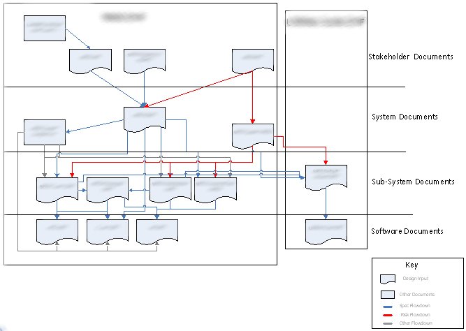
The information in the 2 charts is identical, and the "after" chart met
all the requirements and made the requester happy, but I'm interested if
anyone can suggest ways to reorganize, use color, group, or otherwise
improve a chart like this.
One thing I *did* learn was that using rounded corners on my connector
lines really made the flow easier to follow. I can't figure out quite
why, but it seems like when there are several lines crossing or
overlapping, the curves let the eyes determine naturally which direction
to follow. Does anyone have any thoughts on that?
I also learned that, once I had the chart laid out properly, I could
move things around and find layouts that created fewer crossed lines.
Overlapping lines that all had the same path or similar destination
seemed to help simplify. These are the kinds of ideas I'm interested in,
although bigger (or smaller) concepts are welcome too.
ComponentOne Doc-To-Help 2009 is your all-in-one authoring and publishing
solution. Author in Doc-To-Help's XML-based editor, Microsoft Word or
HTML and publish to the Web, Help systems or printed manuals. http://www.doctohelp.com
Help & Manual 5: The complete help authoring tool for individual
authors and teams. Professional power, intuitive interface. Write
once, publish to 8 formats. Multi-user authoring and version control! http://www.helpandmanual.com/
---
You are currently subscribed to TECHWR-L as archive -at- web -dot- techwr-l -dot- com -dot-